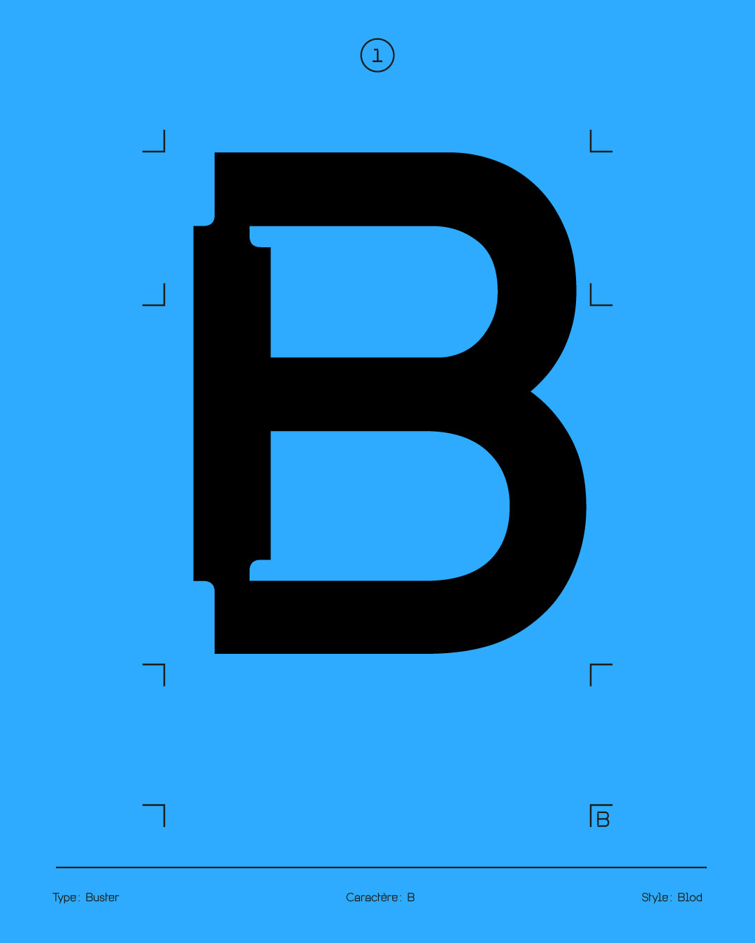
The goal of the exercise was to create a type specimen based on an existing typeface. I chose Buster, designed by Diane Boivin, because of its distinctive features, especially its ink traps. These details emphasize its deconstructed look, which is also reflected in its name.
This neo-grotesque typeface, with geometric shapes and ink traps, comes in two styles. Originally, ink traps were meant to prevent ink spread during printing; here, they serve a primarily aesthetic purpose, giving the typeface its unique visual identity.
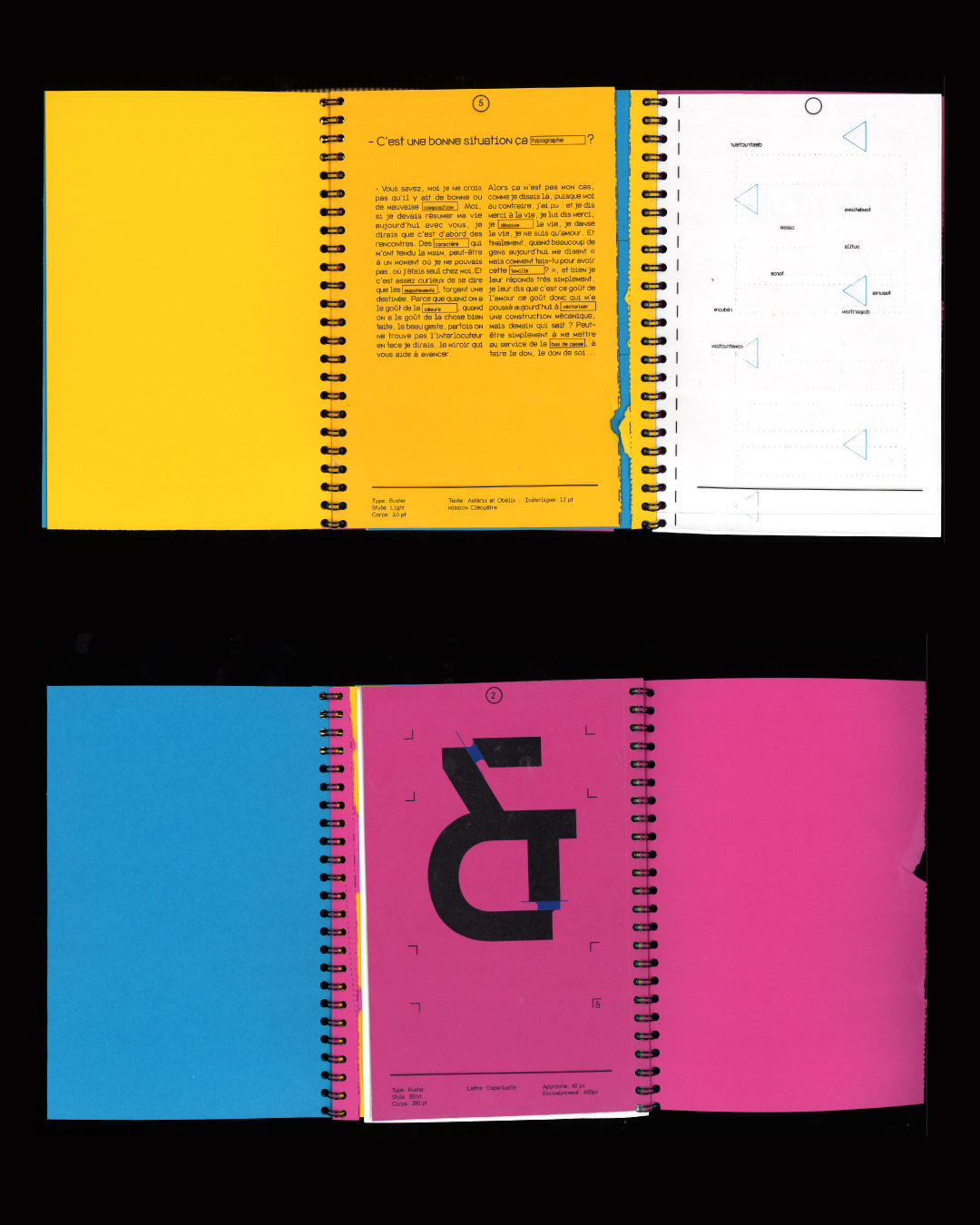
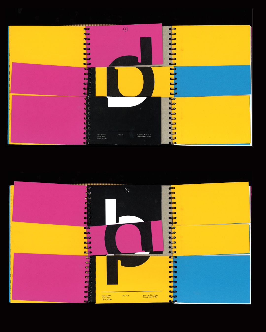
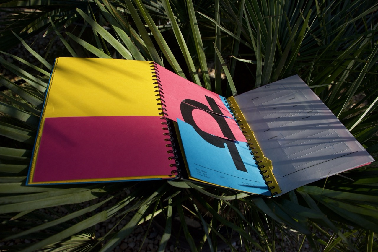
The concept behind my specimen was to deconstruct the booklet in order to rebuild it differently, echoing the very principle of the typeface, which plays with destruction and reconstruction.